How photo filters actually work: the maths behind grayscale, sepia, contrast and blur
A filter is a small formula applied to every pixel. We measured what the browser's filters do to known colours, so you can predict the result instead of guessing.
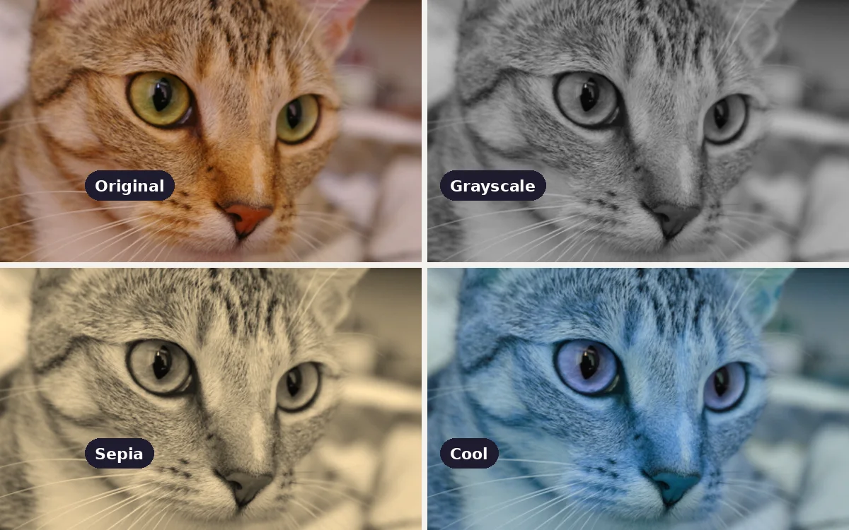
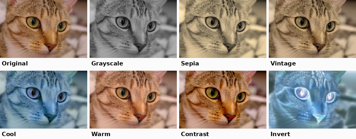
The eight looks in the imgstools Filters tool, applied to the same CC0 photo. Each is one formula, or a short chain of formulas, applied to every pixel.
One-click filters feel like magic, but each is a small, predictable formula. Once you know the formula, you can predict how a filter will treat skin, skies or a red logo before you apply it. The browser filters used by the Filters tool follow the W3C Filter Effects specification. We checked them by filtering solid colours in Chromium 141 and reading back the pixels.
How a pixel is stored
Every pixel has three channels, red, green and blue, each from 0 to 255. Pure red is (255, 0, 0); mid grey is (128, 128, 128). A filter takes those three numbers and returns three new ones. Most colour filters do this with a small grid of weights called a colour matrix: each output channel is a weighted sum of the three input channels.
Grayscale: not a simple average
You might expect grayscale to average the three channels. It doesn't, because our eyes are far more sensitive to green than to blue. The formula weights each channel by how bright it looks:
grey = 0.2126 × R + 0.7152 × G + 0.0722 × B
What we measured:
| Input colour | Average of R, G, B would give | Chrome's grayscale gave |
|---|---|---|
| Pure red (255, 0, 0) | 85 | 54 |
| Pure green (0, 255, 0) | 85 | 182 |
| Pure blue (0, 0, 255) | 85 | 18 |
| Tan (200, 150, 100) | 150 | 157 |
These match the formula to within rounding. One subtlety: the browser applies the weights directly to the stored 0–255 values, without first converting to linear light. That is fast and standard for web filters, but it makes saturated reds and blues come out darker than they really look. A bright red logo can turn into a surprisingly dark grey.
Practical consequence: red text on a dark background can lose almost all its contrast in grayscale. Check important text and logos after converting.
Sepia: a warm grayscale
Sepia is another colour matrix. Each output channel mixes all three inputs, with red receiving the most and blue the least, so everything shifts towards brown:
R′ = 0.393 R + 0.769 G + 0.189 B G′ = 0.349 R + 0.686 G + 0.168 B B′ = 0.272 R + 0.534 G + 0.131 B
Mid grey (128, 128, 128) came out as (173, 154, 120), exactly as the formula predicts. Note that the result is also brighter: the weights for red add up to 1.351 and for green to 1.203, so light areas can hit the 255 ceiling and lose detail. On bright photos, sepia can wash out highlights such as white shirts or skies.
Brightness, contrast and invert
These work on each channel separately.
- Brightness multiplies: brightness(1.2) turned mid grey 128 into 153. Anything already above about 212 hits 255 and flattens into pure white.
- Contrast stretches values away from the midpoint: new = (old − 127.5) × amount + 127.5. With contrast(1.3), tan's red channel went from 200 to 221 and its blue from 100 to 91. Light areas get lighter, dark areas darker, and the extremes clip.
- Invert subtracts from the maximum: new = 255 − old. Red becomes cyan (0, 255, 255) and mid grey stays almost unchanged at 127.
Hue rotation and saturation
- hue-rotate spins every colour around the colour wheel by a given angle. At 180° blues become oranges and greens become magentas. The imgstools "cool" preset uses this, with a little desaturation, to push warm photos towards blue.
- saturate scales how far each colour sits from its grey equivalent. 0 is fully grey, 1 is unchanged, and values above 1 intensify colour. Over about 1.3, skin tones tend to turn orange and blue skies start to band.
The presets, decoded
| Preset | Formula chain | What to expect |
|---|---|---|
| Grayscale | grayscale 100% | Luminance-weighted greys; reds go dark |
| Sepia | sepia 100% | Brown monochrome, brighter overall |
| Vintage | sepia 60%, contrast 1.1, brightness 0.95 | Partial warm tone with slightly deeper shadows |
| Cool | hue-rotate 180°, saturate 0.8, brightness 1.05 | Strong colour shift; best on scenes without skin |
| Warm | sepia 30%, saturate 1.2, brightness 1.05, hue-rotate −10° | Golden tint with richer colour |
| Contrast | contrast 1.3 | Punchier image; watch highlight and shadow clipping |
| Brightness | brightness 1.2 | Lifts everything; bright areas clip first |
| Invert | invert 100% | Photographic negative |
| Blur | Gaussian blur, 4 px | Soft focus for backgrounds or privacy |
Order matters in a chain. Sepia followed by contrast is not the same as contrast followed by sepia, because each step changes the numbers the next step receives.
Blur, and the edge problem we fixed
Blur is different: it mixes each pixel with its neighbours, using a bell-shaped (Gaussian) weighting. In blur(4px), 4 px is the standard deviation of that bell curve. Pixels up to about 12 px away (three standard deviations) still have a visible influence.
That creates an edge problem. Pixels near the border are partly averaged with "nothing" beyond the edge of the image. When we blurred a solid blue square in Chromium, the result was fully opaque in the middle, but opacity fell to 55% at the edges and 30% in the corners, giving a faded border. Saved as PNG, that border is semi-transparent. On a dark page it looks like a dark halo; in a document it looks washed out.
The imgstools Filters tool now avoids this. Before blurring, it extends the image's outermost pixels outwards by 12 px, then crops back to the original size, so the border stays opaque. If you use another tool's blur and see faded edges, this is the reason.
Using filters well
- Start from a corrected photo. Filters amplify problems. Fix exposure, crop and rotation first with Enhance, Crop and Rotate.
- Be consistent across a set. For a blog or shop, use one look for all your images. Mixing sepia, cool and high-contrast photos on one page looks accidental.
- Check skin, text and logos. These suffer most: skin under hue rotation, red text under grayscale, white logos under brightness.
- Keep the original. Every filter is destructive once saved. Clipped highlights cannot be brought back.
- Prefer subtle. Most professional "looks" are far gentler than a 100% preset. If the effect is the first thing people notice, it is probably too strong.
Method
Each filter string from the imgstools Filters tool was applied with a 2D canvas filter in Chromium 141 to solid-colour test swatches. The resulting pixels were read back with getImageData and compared with the W3C Filter Effects formulas. Blur edge opacity was measured on a 200 × 200 solid square. The preview grid uses a CC0 photo by Stefan van der Walt.
Keep exploring
More from imgstools
Can You Really Enhance a Low-Resolution Photo? What Upscaling and Sharpening Actually Do
Read note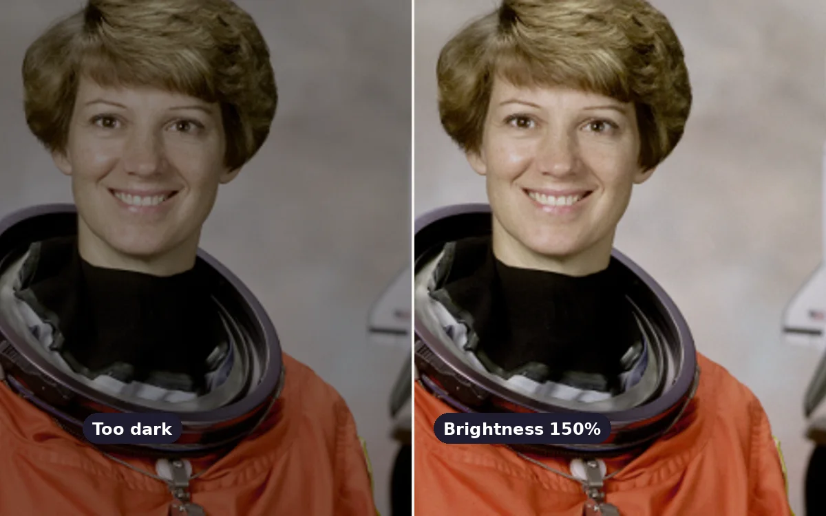
Fixing a dark or washed-out photo: brightness, contrast or saturation?
Read note