Resize First, Then Compress: How a 2.2 MB Photo Became 100 KB
Lowering quality alone kept our camera photos above 1.5 MB. Resizing to the size the page actually shows took them under 200 KB. Measured on eight photos, with the widths to use.
Photo by Leeloo The First on Pexels.
When a photo is too big, most people reach for the quality slider. That is the wrong control to start with. We measured eight camera photos, and the size of the photo in pixels mattered much more than the quality setting.
The test
We used eight photos straight from modern cameras, between 6000 and 6785 pixels wide (24–30 megapixels). Their original files had a median size of 2,210 KB, ranging from 974 KB to 4.8 MB. We saved each one in two ways: at full size with a lower JPEG quality, and resized to common web widths at JPEG quality 85. The encoder was sharp 0.35 (mozjpeg), and the results are medians.
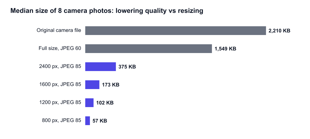
| Version | Median size |
|---|---|
| Original camera file | 2,210 KB |
| Full size, JPEG 85 | 2,381 KB |
| Full size, JPEG 60 | 1,549 KB |
| 2400 px wide, JPEG 85 | 375 KB |
| 1600 px wide, JPEG 85 | 173 KB |
| 1200 px wide, JPEG 85 | 102 KB |
| 800 px wide, JPEG 85 | 57 KB |
| 1600 px wide, JPEG 60 | 90 KB |
| 1200 px wide, JPEG 60 | 59 KB |
Two things stand out:
- Lowering quality alone barely helped. Saving the full-size photo at JPEG 60, a setting that visibly softens fine detail, still left a 1.5 MB file. Saving it at JPEG 85 made the file larger than the camera's original, because the camera had already compressed it at a similar level.
- Resizing did almost all the work. Going from a 6000 px original to 1600 px removes about 93% of the pixels. At a good quality setting, the file dropped from about 2.2 MB to 173 KB.
The reason is simple arithmetic: file size follows the number of pixels, and pixel count grows with the square of the width. Halving the width leaves a quarter of the pixels. In our test, 1600 px to 800 px took the median from 173 KB to 57 KB.
The same pattern in the browser
We repeated a smaller version of the test with the browser's own high-quality resizing, the setting the resize tool uses, saving each step as JPEG 80:
| Image | Full size | 75% width | 50% width | 25% width |
|---|---|---|---|---|
| Hubble Deep Field (1000 × 872) | 153 KB | 84 KB | 44 KB | 14 KB |
| Rocket launch (640 × 427) | 32 KB | 18 KB | 9.6 KB | 3.4 KB |
| Dashboard screenshot (1280 × 800) | 64 KB | 43 KB | 24 KB | 8.9 KB |
Halving the width cut the photos to 29–30% of their size and the screenshot to 37%, close to the 25% you would predict from pixel count. Small files carry a little fixed overhead, and text keeps its sharp edges at any size, so they shrink slightly less than the pixel count.
What width do you actually need?
Pick the width from the space the image fills on the page, multiplied by the screen's pixel density. Most phones and many laptops have "2×" screens, which pack two device pixels into each CSS pixel in both directions.
Pixels to export = width of the slot in CSS pixels × 2
| Where the image appears | Slot width | Export width |
|---|---|---|
| Blog article column | 680–760 px | 1400–1600 px |
| Two-column grid card | 360–480 px | 720–960 px |
| Thumbnail or avatar | 80–160 px | 160–320 px |
| Full-width hero on a laptop | 1280–1440 px | 1920–2400 px |
| Image for an email newsletter | 600 px | 1200 px |
To find the slot width, right-click the image on your page, choose Inspect, and read the rendered size your browser reports. Going above 2× is rarely worth it: a 3× phone screen gains little visible sharpness, and the file grows by the square of the width.
Worked example: a phone photo in a blog post
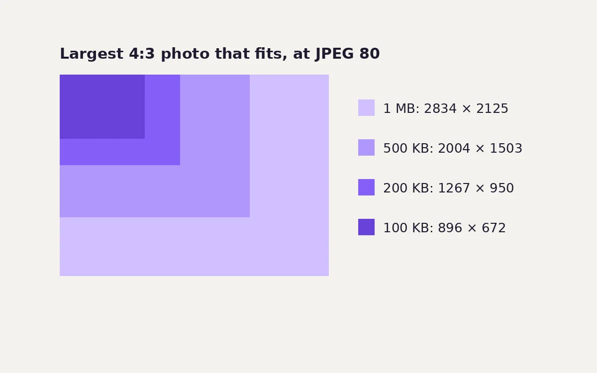
A typical 12-megapixel phone photo is 4032 × 3024 pixels. In a 720-pixel article column on a 2× screen it needs 1440 × 1080. That is 1.56 million pixels instead of 12.2 million, 7.8 times fewer, before you touch the quality setting. To fit a strict upload limit such as 100 KB instead, see how to get an image under 100 KB, which turns these measurements into a pixel budget for each limit.
When bigger is the right call
- Images people zoom into, such as product photos with a zoom feature, maps, or infographics with small text. Export at the zoomed size.
- Downloads and print. Link to a separate full-resolution file instead of putting it in the page.
- Your own archive. Keep the full-resolution original. Downscaling is one-way, as our upscaling test shows.
The right order: resize, then compress
- Resize the original to the export width from the table above.
- Compress that resized image to JPEG or WebP at about 80, checking the result.
- Keep the original untouched in case you need a different size later.
Do it in this order. Compressing first and then resizing means the image is saved with lossy compression twice. As our re-saving test showed, editing and re-saving in between steps is where quality loss adds up.
One thing to know if you use imgstools
The resize tool saves its output as PNG. PNG keeps every pixel exactly, which is ideal for screenshots and graphics. For photographs, though, PNG files are large. In our test, a 1600 px PNG of these photos had a median size of 2,384 KB, and 6 of the 8 PNGs were bigger than the original camera JPEG.
So for photos, don't stop after resizing. Put the resized PNG through the compress tool and choose JPEG or WebP. At quality 80, our 1600 px photos had a median of 139 KB as JPEG and 74 KB as WebP. Neither step uploads your file; both run in the browser.
Things that go wrong when resizing
- Distorted proportions. A width and height that don't match the original's shape stretch the image. Keep the aspect ratio locked, or crop to the new shape first with the crop tool.
- Upscaling by accident. Entering 2000 px for a 1200 px original enlarges it. The file gets bigger and softer, never sharper.
- Forgetting the height on your page. Set width and height on the image tag, or an aspect-ratio in CSS, so the browser reserves the space and the layout doesn't jump while the image loads.
Common questions
Will a smaller image look blurry on large screens? Only if the slot is wider than the image's pixel width divided by the screen density. Size for the largest slot the image will fill, at 2×.
Doesn't my website platform resize images automatically? Many platforms create smaller copies for thumbnails, but often keep the full original for the main image or the link. Uploading a sensibly sized file also saves storage and makes uploads faster.
What about images I want people to download in full resolution? Link to the full file separately. Show a resized version on the page.
Summary
- Pixel dimensions control file size far more than the quality slider does.
- Export at about twice the width the image fills on screen: 1400–1600 px for an article column.
- Resize first, compress last, once, to JPEG or WebP at about 80.
- If you need to hit a strict limit like 100 KB, choose a smaller width before you choose a lower quality. See our quality setting test for the numbers.
Keep exploring